PRODUCT DESIGNER
year: 2025-2026
Farmatodo
One of Latin America’s largest pharmacy chains serving over 10 million users through its mobile app - offering everything from prescriptions to every day essentials.
→ challenge
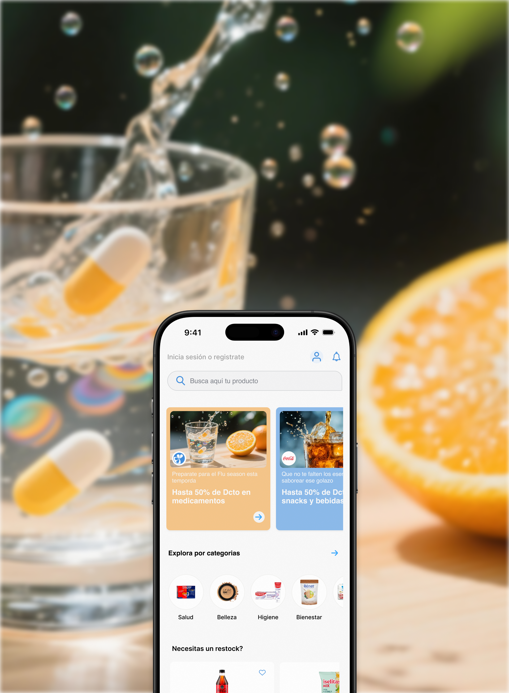
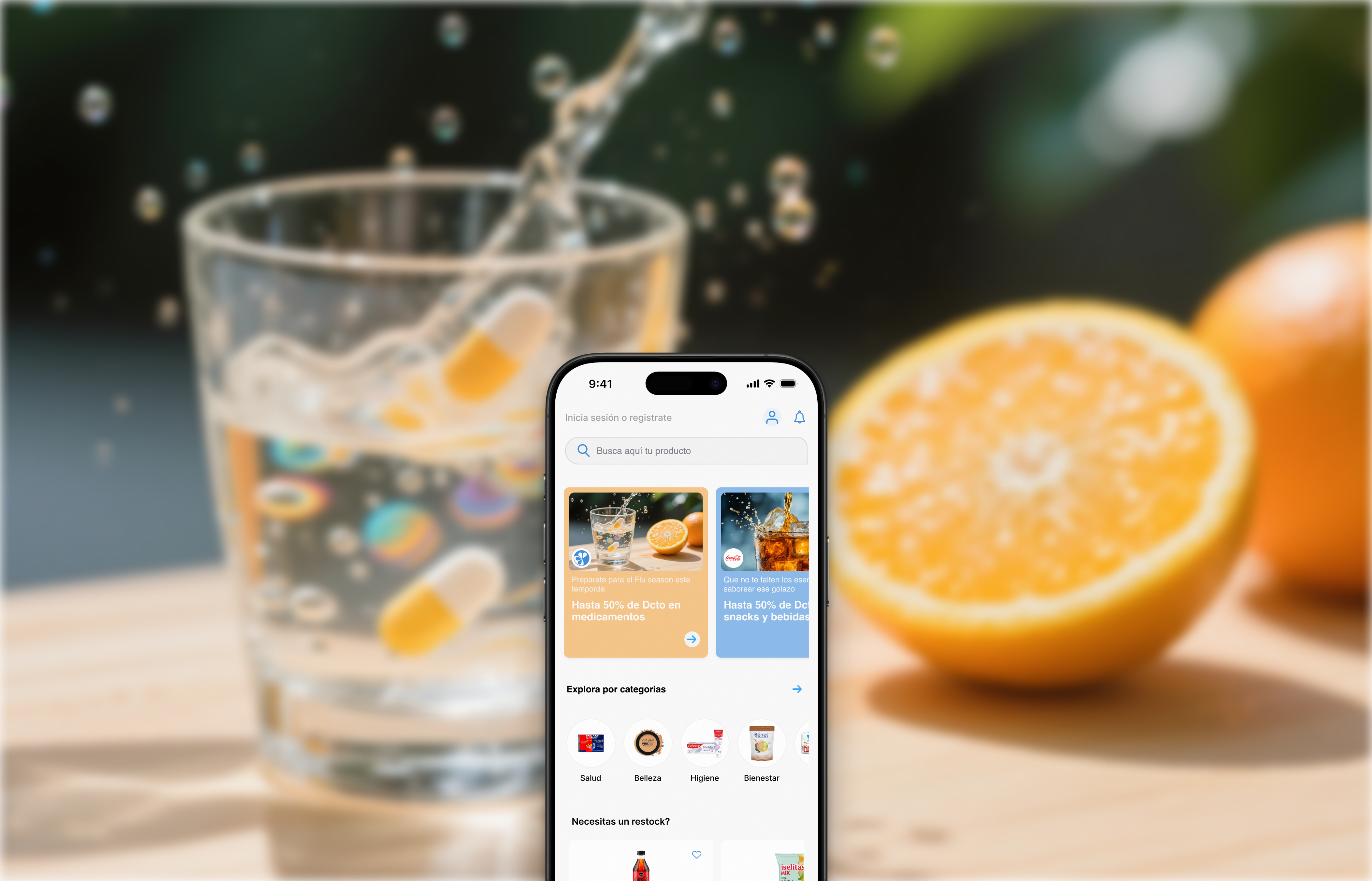
Yet Farmatodo's homepage wasn't pulling its weight: the layout was crowded and unfiltered, with no category filtering to speak of. Users skipped past it entirely and went straight to search, missing most of what Farmatodo actually offered.
→ Opportunity
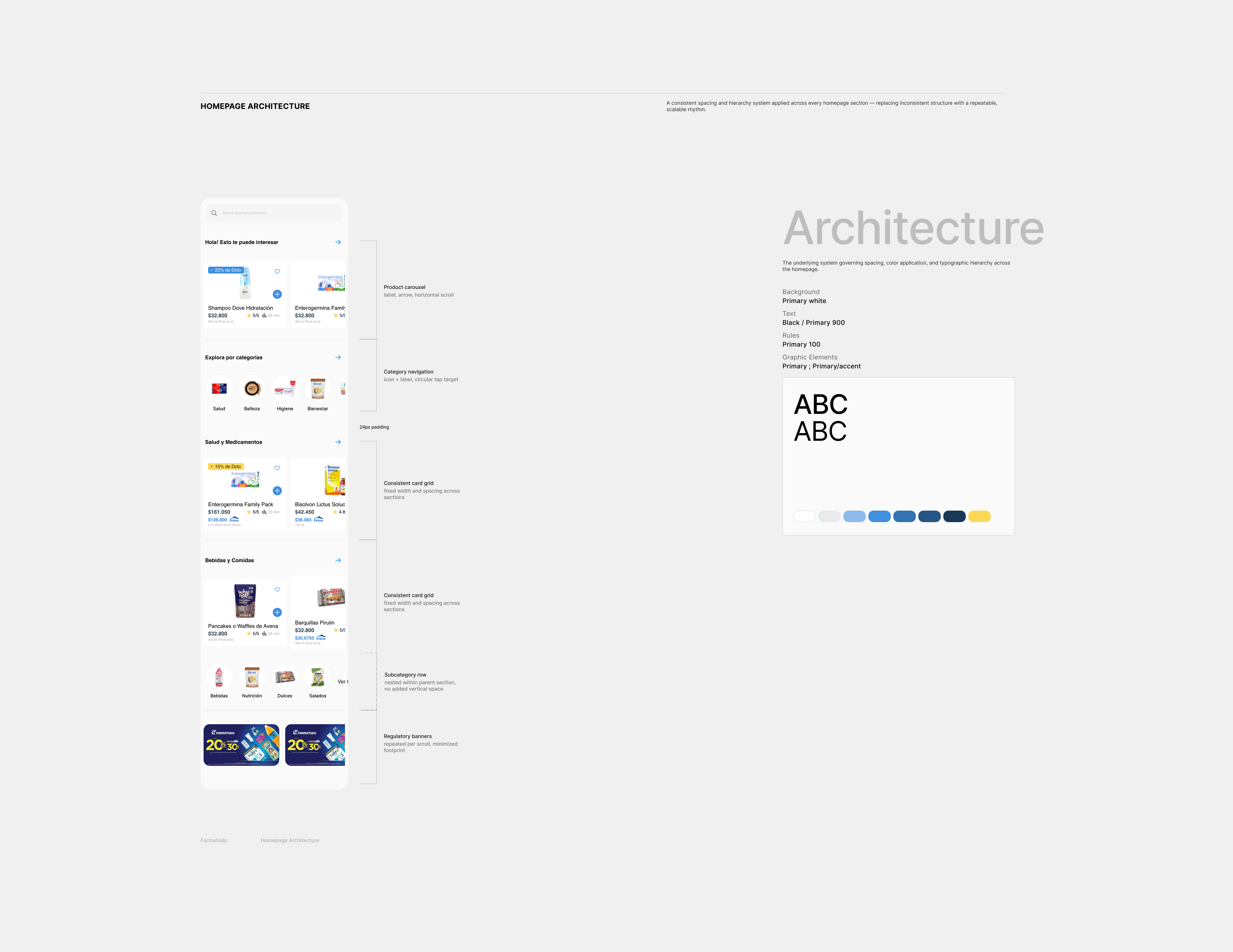
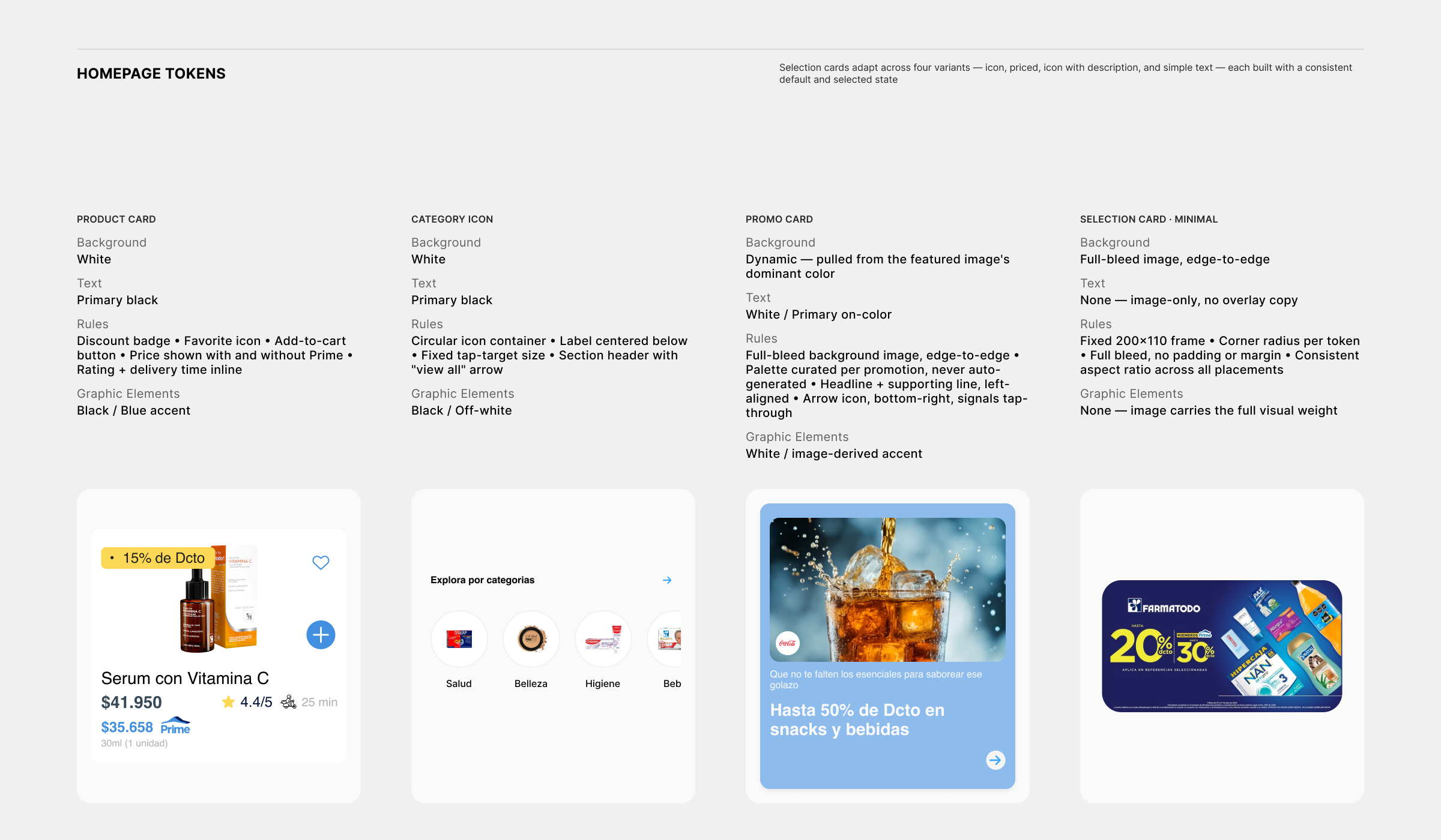
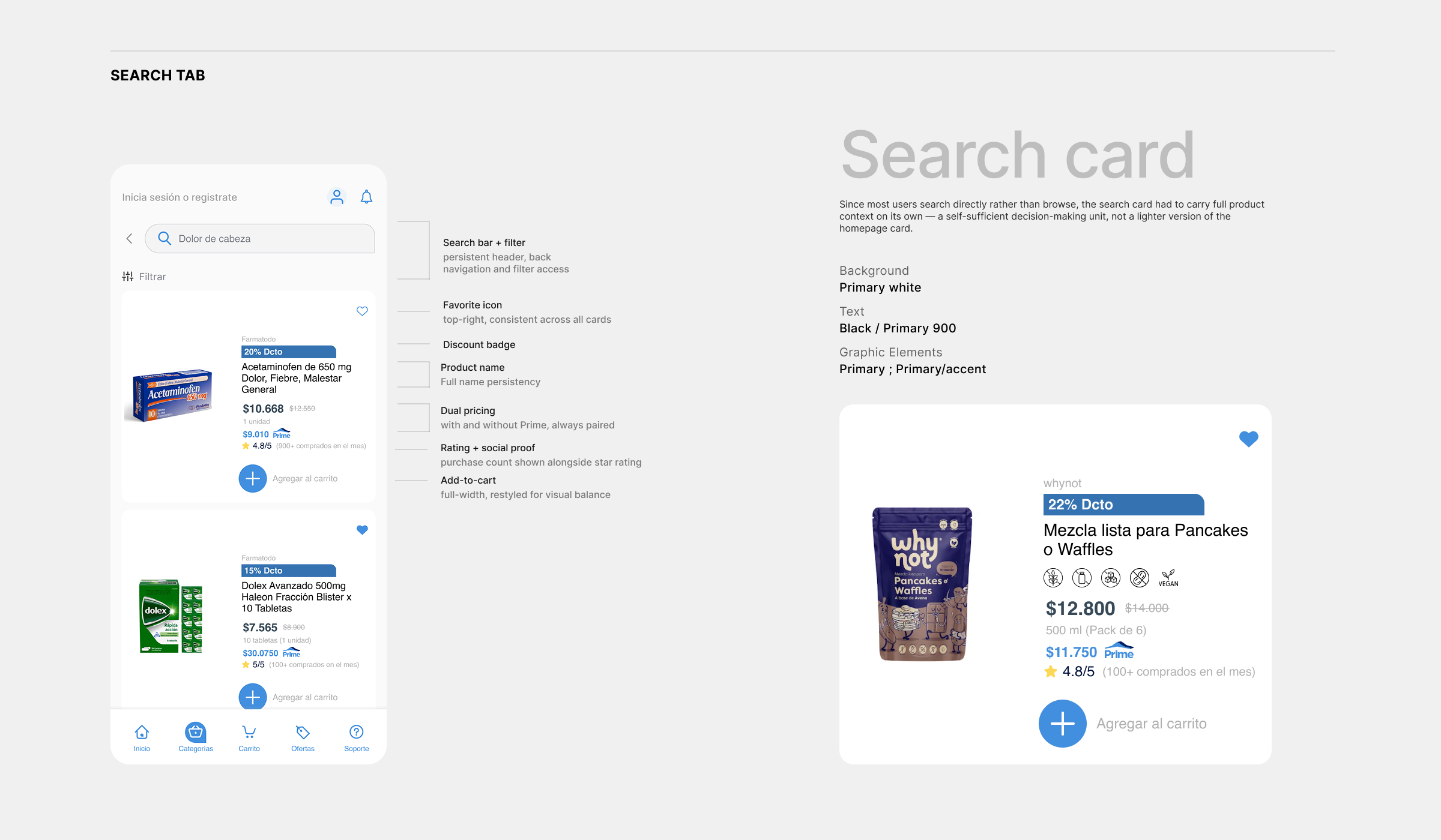
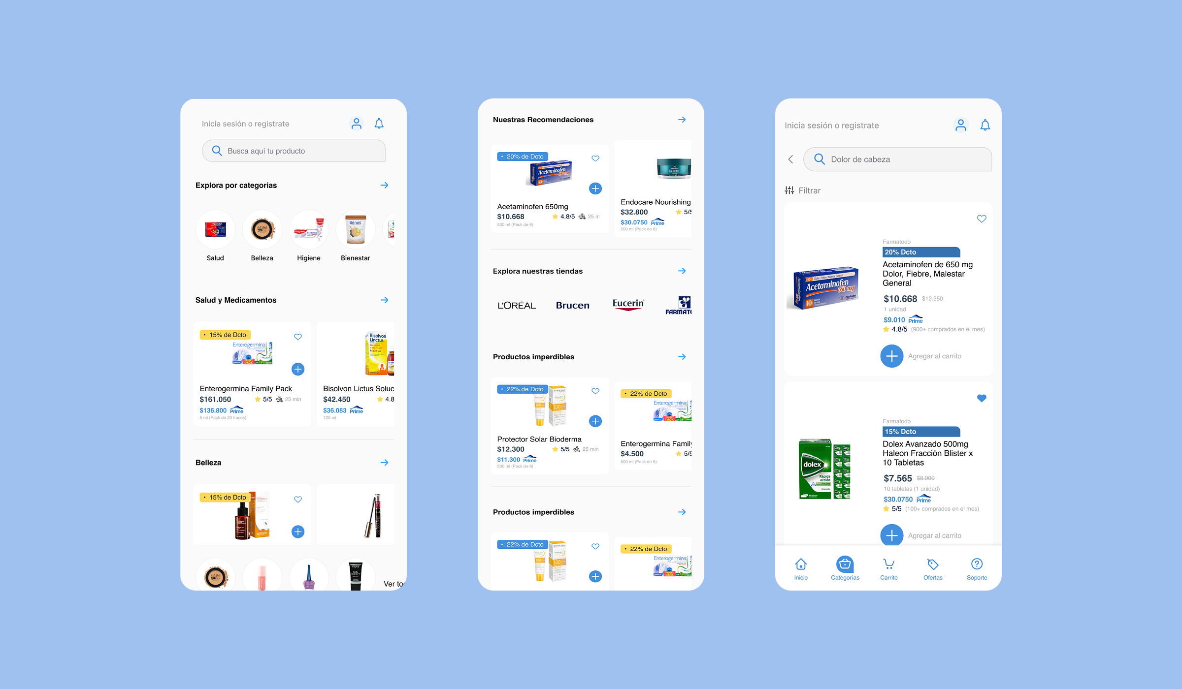
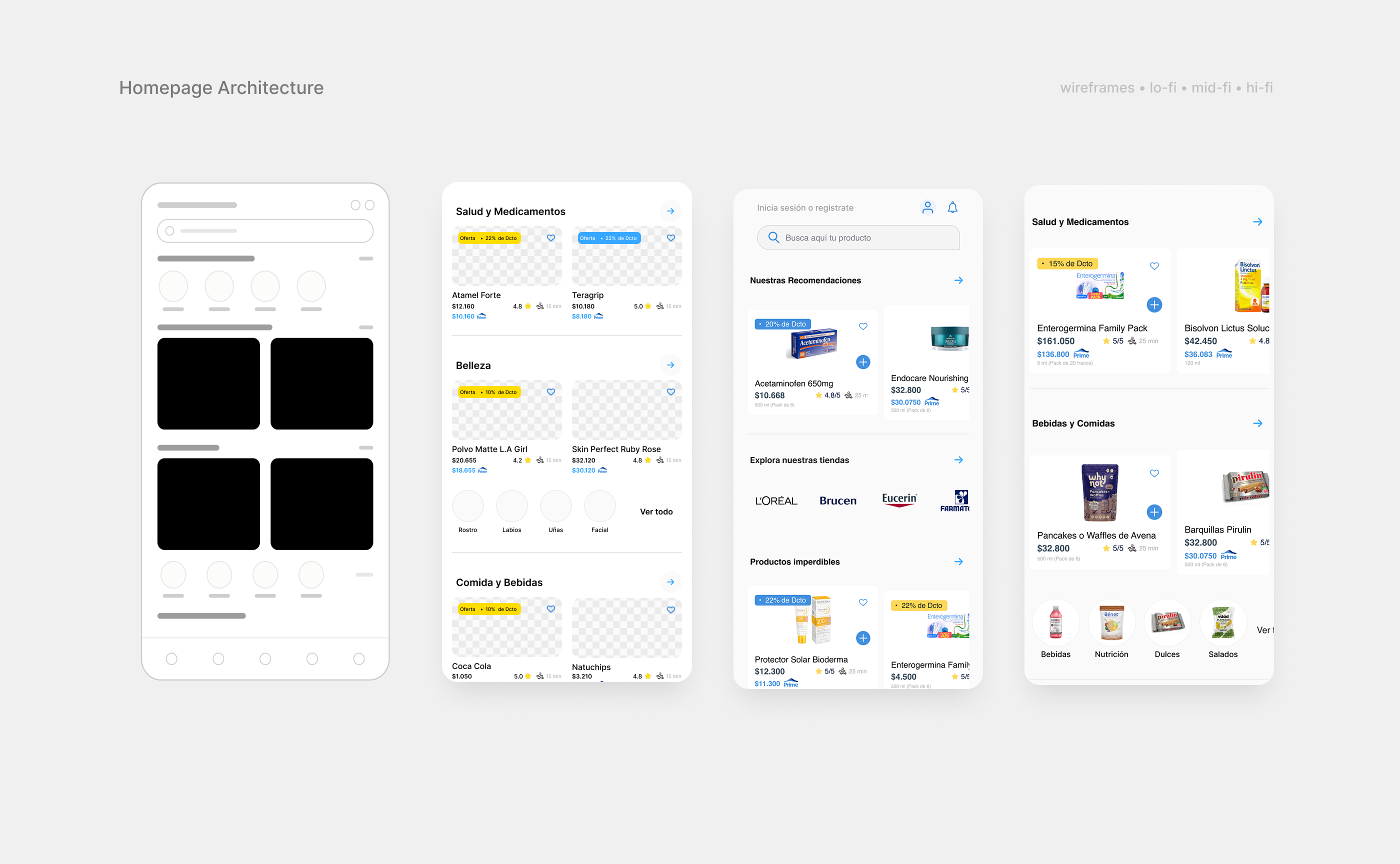
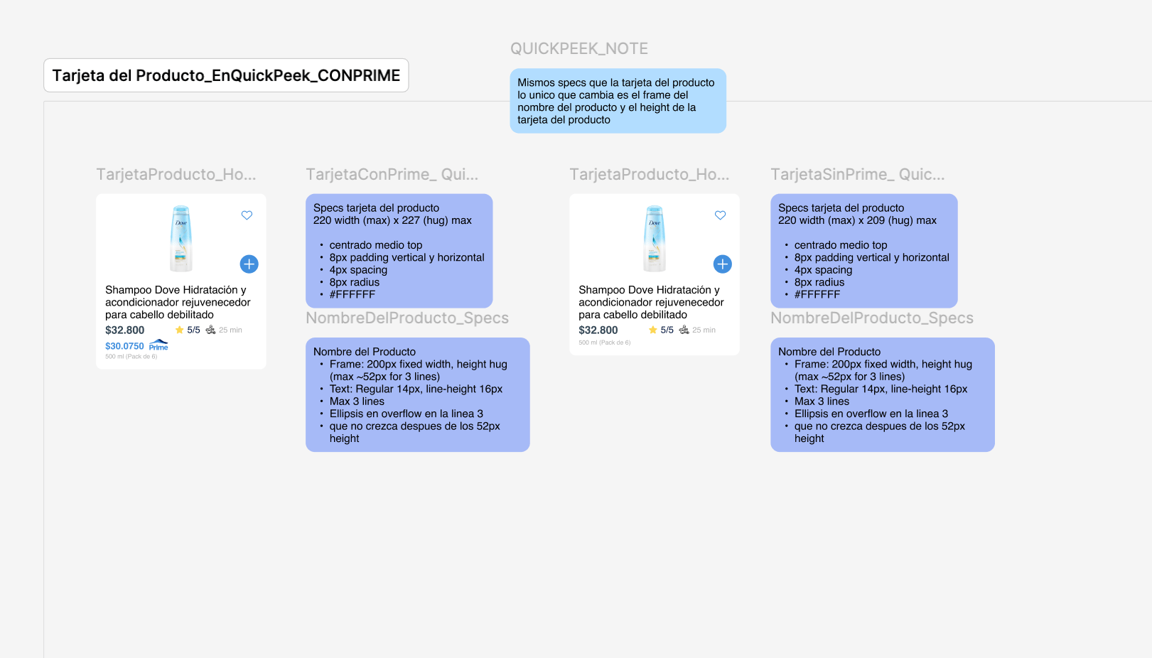
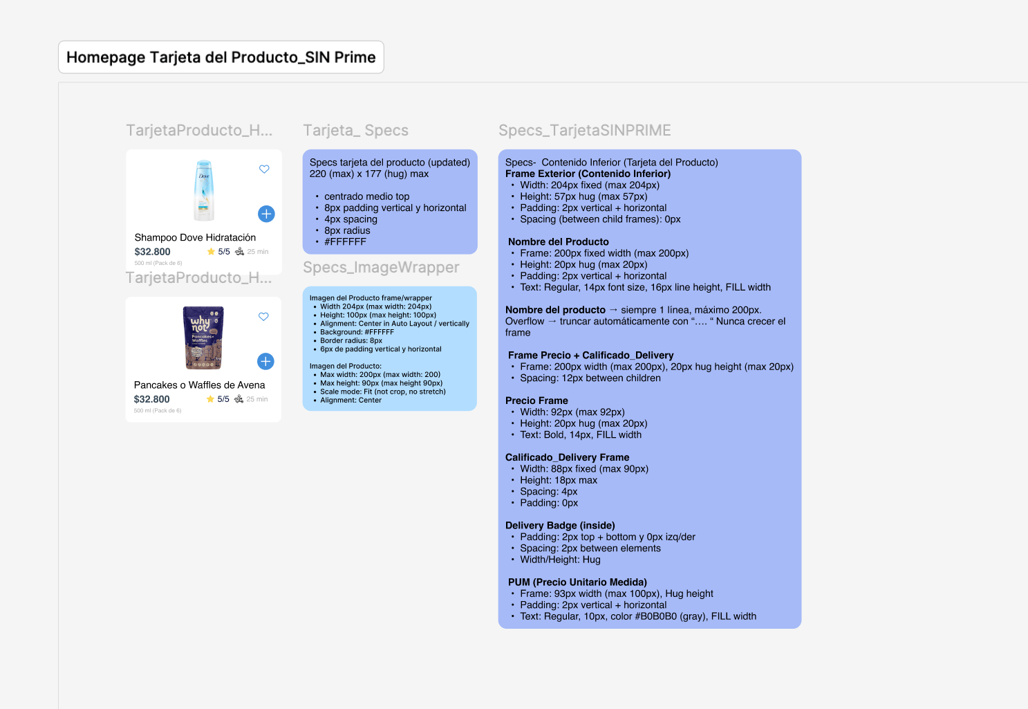
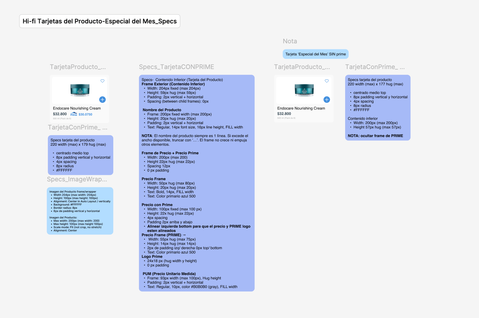
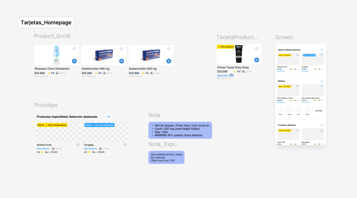
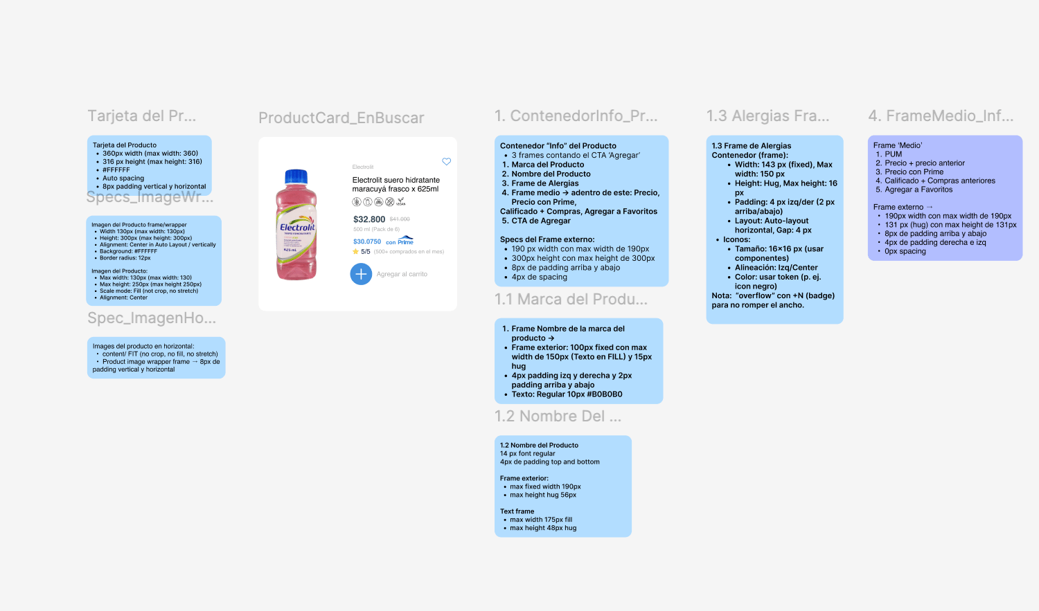
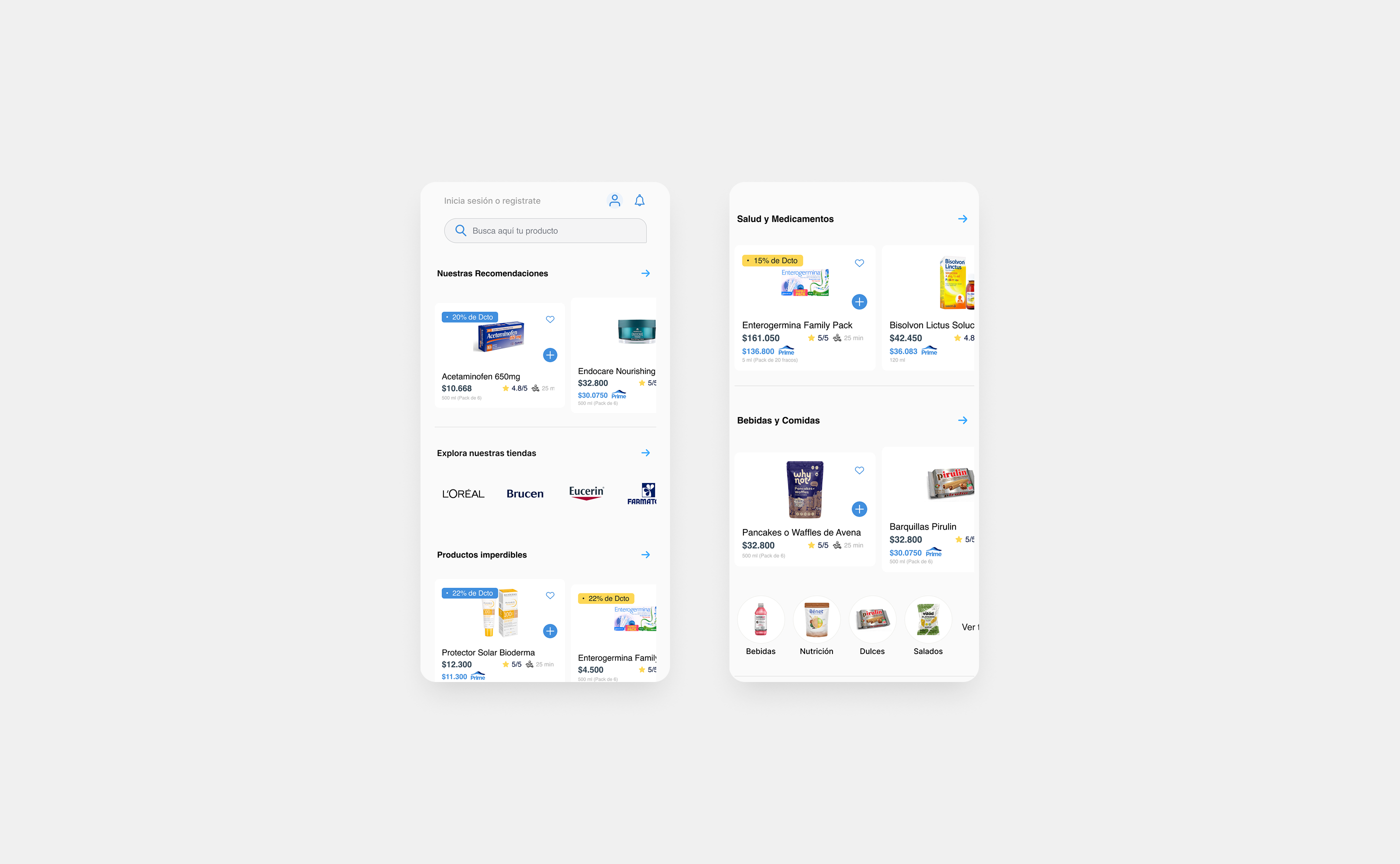
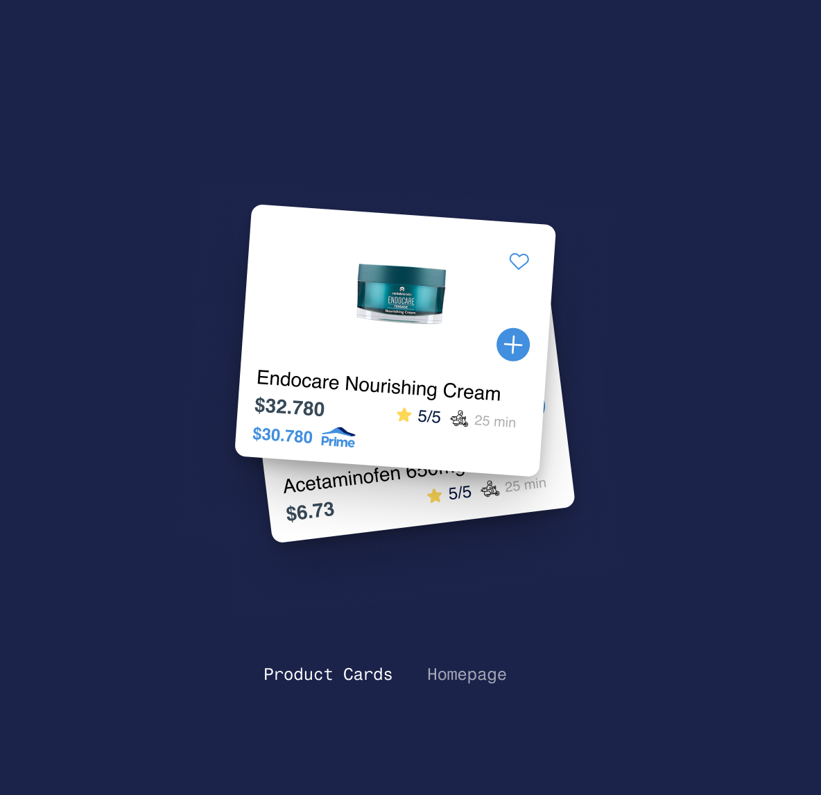
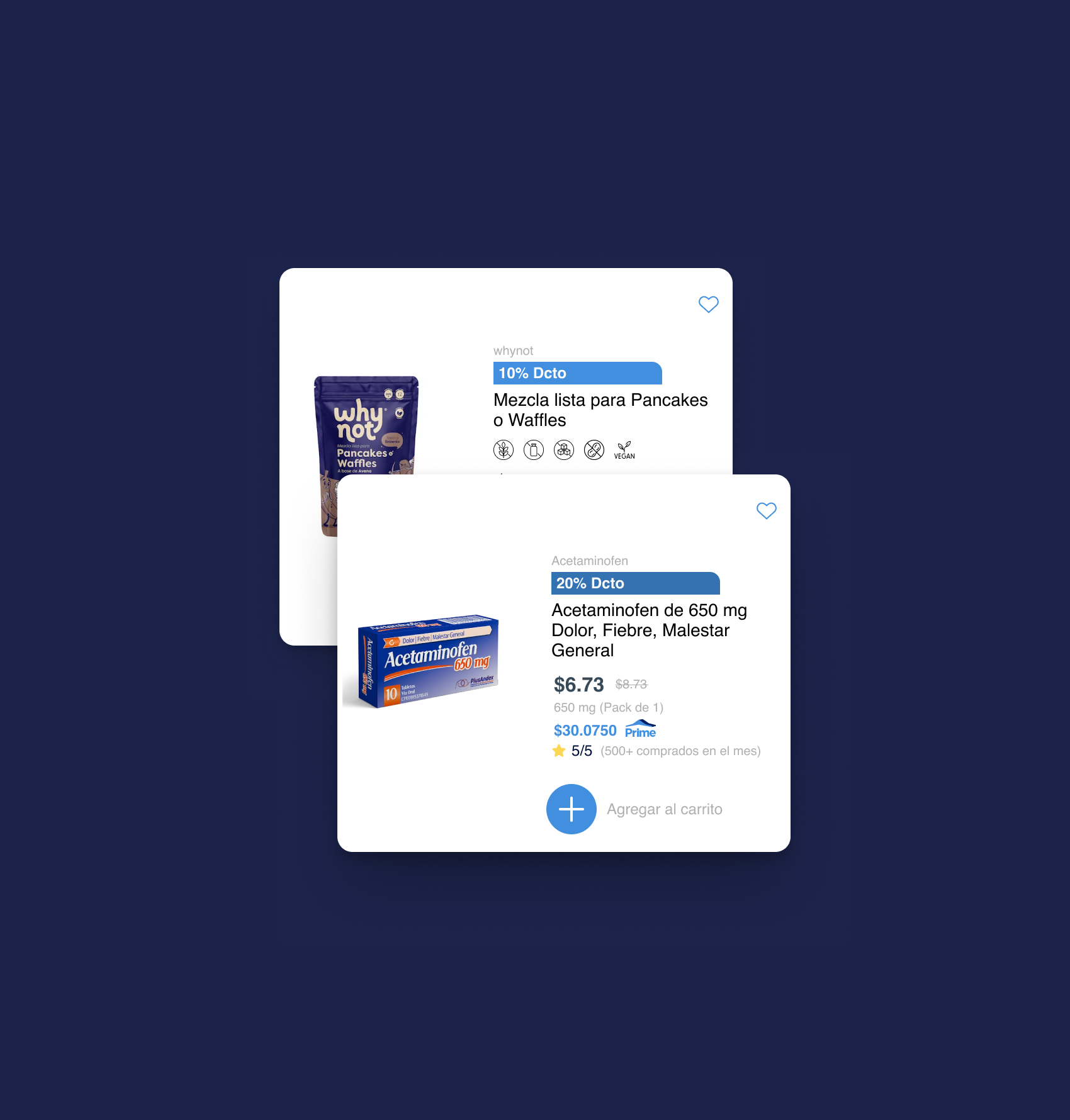
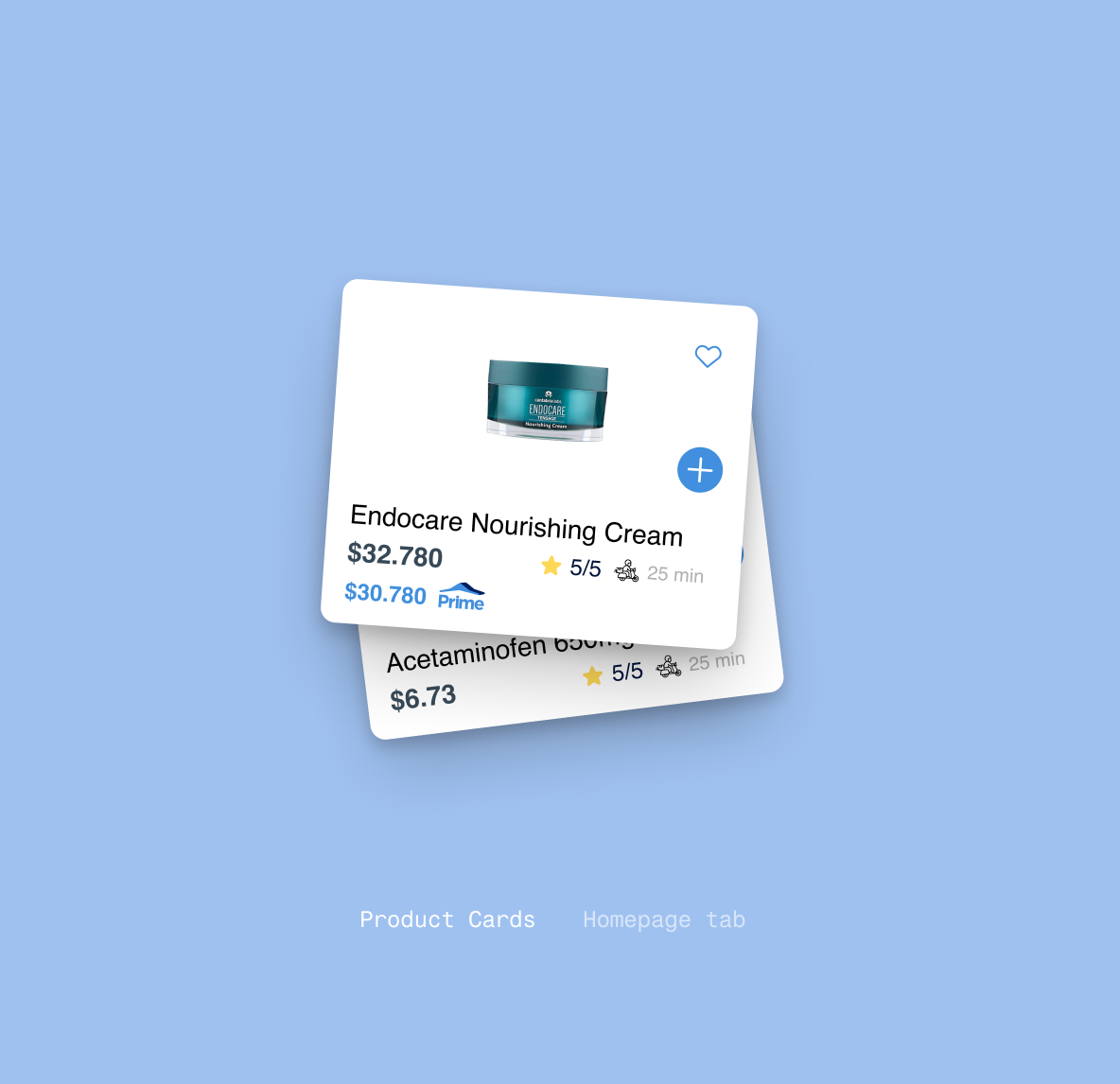
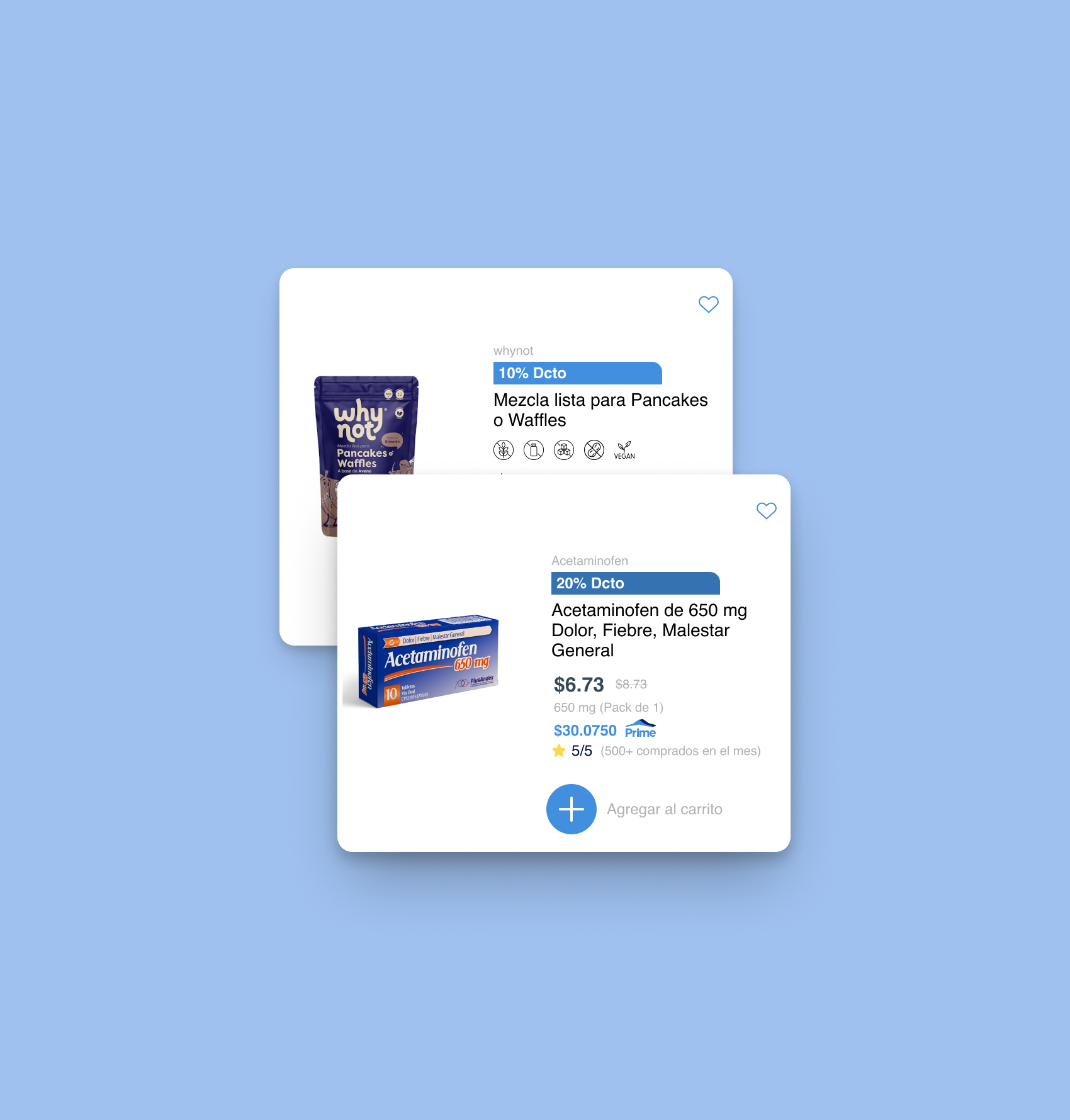
I redesigned Farmatodo's homepage architecture within its existing design system, organizing 8 major categories and 65+ subcategories — health, beauty, food, home, and more — into a structure users could actually scan, replacing a flat layout with no hierarchy. Users could now discover products in a way that was finally clean and readable, instead of relying on search alone. The new hierarchy carries through to Search as well, with cards built on allergen icons and a colorpicker for beauty and nail products — improving clarity for high-consideration purchases across a catalog spanning dozens of subcategories. Every card is fully responsive, holding its structure whether a product name and details run short or long.
→ outcome
The homepage architecture and foundational redesign are live in production today. The homepage has gone from a screen users skipped past to one they actively browse, helped by additions like a dynamic promotions section surfacing seasonal campaigns to drive engagement. The expandable product card system — including allergen indicators and the beauty/nail colorpicker — is currently in implementation as part of the next phase. This was the foundation of a larger redesign that's still in progress.
INFORMATION ARCHITECTURE
DESIGN SYSTEM
PLATFORM DESIGN
UI/VISUAL DESIGN
CREATIVE DIRECTION









Other Projects
Exponent Financial
See Project
→
TableN8
See Project
→
Mind Studio AI
See Project
→


Farmatodo
One of Latin America’s largest pharmacy chains serving over 10 million users through its mobile app - offering everything from prescriptions to every day essentials.
PRODUCT DESIGNER
year: 2025-2026
→ challenge
Yet Farmatodo's homepage wasn't pulling its weight: the layout was crowded and unfiltered, with no category filtering to speak of. Users skipped past it entirely and went straight to search, missing most of what Farmatodo actually offered.
→ Opportunity
I redesigned Farmatodo's homepage architecture within its existing design system, organizing 8 major categories and 65+ subcategories — health, beauty, food, home, and more — into a structure users could actually scan, replacing a flat layout with no hierarchy. Users could now discover products in a way that was finally clean and readable, instead of relying on search alone. The new hierarchy carries through to Search as well, with cards built on allergen icons and a colorpicker for beauty and nail products — improving clarity for high-consideration purchases across a catalog spanning dozens of subcategories. Every card is fully responsive, holding its structure whether a product name and details run short or long.
→ outcome
The homepage architecture and foundational redesign are live in production today. The homepage has gone from a screen users skipped past to one they actively browse, helped by additions like a dynamic promotions section surfacing seasonal campaigns to drive engagement. The expandable product card system — including allergen indicators and the beauty/nail colorpicker — is currently in implementation as part of the next phase. This was the foundation of a larger redesign that's still in progress.
INFORMATION ARCHITECTURE • DESIGN SYSTEM• PLATFORM DESIGN • UI/VISUAL DESIGN • CREATIVE DIRECTION

Other Projects
Exponent Financial
See Project
→
TableN8
See Project
→
Mind Studio AI
See Project
→


Farmatodo
One of Latin America’s largest pharmacy chains serving over 10 million users through its mobile app - offering everything from prescriptions to every day essentials.
PRODUCT DESIGNER
year: 2025-2026
→ challenge
Yet Farmatodo's homepage wasn't pulling its weight: the layout was crowded and unfiltered, with no category filtering to speak of. Users skipped past it entirely and went straight to search, missing most of what Farmatodo actually offered.
→ Opportunity
I redesigned Farmatodo's homepage architecture within its existing design system, organizing 8 major categories and 65+ subcategories — health, beauty, food, home, and more — into a structure users could actually scan, replacing a flat layout with no hierarchy. Users could now discover products in a way that was finally clean and readable, instead of relying on search alone. The new hierarchy carries through to Search as well, with cards built on allergen icons and a colorpicker for beauty and nail products — improving clarity for high-consideration purchases across a catalog spanning dozens of subcategories. Every card is fully responsive, holding its structure whether a product name and details run short or long.
→ outcome
The homepage architecture and foundational redesign are live in production today. The homepage has gone from a screen users skipped past to one they actively browse, helped by additions like a dynamic promotions section surfacing seasonal campaigns to drive engagement. The expandable product card system — including allergen indicators and the beauty/nail colorpicker — is currently in implementation as part of the next phase. This was the foundation of a larger redesign that's still in progress.
INFORMATION ARCHITECTURE • DESIGN SYSTEM• PLATFORM DESIGN • UI/VISUAL DESIGN • CREATIVE DIRECTION

Other Projects
Exponent Financial
See Project
→
TableN8
See Project
→
Mind Studio AI
See Project
→
